There are many ways to create responsive form using Html and Css but first let’s remember that most form fields display inline.
Label or Placeholder ?
Depending on your preference, you may want to use just a placeholder to specify the required input data or you may want to have a label indicating what kind of data to be entered in a particular input field, the main determining factor here is your design preference.
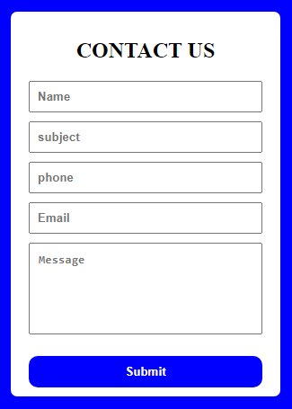
Responsive form using Placeholder
HTML

<main class="wrapper">
    <section class="main-container">
      <h1>CONTACT US</h1>
      <form>

        <div>
          <!-- name -->
          <input type="text" placeholder="Name" id="name" />
          <!-- subject -->
          <input type="text" placeholder="subject" id="subject" />
          <!-- number -->
          <input type="number" placeholder="phone" id="phone" />
          <!-- email -->
          <input type="email" name="" placeholder="Email" id="email" />
          <!-- textArea -->
          <textarea
            cols="33"
            rows="6"
            placeholder="Message"
            id="textarea"
          ></textarea>
          <button>Submit</button>
        </div>
      </form>
    </section>
    </main>


CSS
* {
  margin: 0;
  padding: 0;
  box-sizing: border-box;
} /* general selector to remove pre-existing margin and padding*/
.wrapper {
  display: flex;
  justify-content: center;
  align-items: center;
  height: 100vh;
  width: 100%;
  background-color: blue;
}
.main-container {
  padding: 10px 20px;
  width: 300px;
  background-color: white;
  border-radius: 7px;
}
h1 {
  text-align: center;
  margin: 20px;
}
.main-container input {
  display: block;
  padding: 8px;
  margin: 10px 0;
  width: 100%;
  font-weight: bold;
}
.main-container textarea {
width: 100%;
  font-weight: bold;
  padding-left: 10px;
  padding-top: 10px;
}
.main-container button {
  background-color: blue;
  width: 100%;
  padding: 10px;
  border-radius: 10px;
  color: white;
  font-weight: bold;
  outline: none;
  border: none;
  margin-top: 20px;
  cursor: pointer;
  transition: 2s;
}
.main-container button:hover {
  background-color: chartreuse;
}
Use an image as the background by following this guide here.
And like I said, the main determining factor here is your design preference. It is quite easy to change from placeholder to label using the code below.
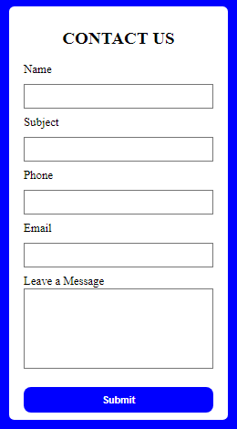
Responsive form using Label
Html

<section class="main-container">
      <h1>CONTACT US</h1>
      <form >
        <div>
          <!-- name -->
          <label for="">Name</label>
          <input type="text" placeholder="" id="name" />
          <!-- subject -->
          <label for="">Subject</label>

          <input type="text" placeholder="" id="subject" />
          <!-- number -->
          <label for="">Phone</label>

          <input type="number" placeholder="" id="phone" />
          <!-- email -->
          <label for="">Email</label>

          <input type="email" name="" placeholder="" id="email" />
          <!-- textArea -->
          <label for="">Leave a Message</label>

          <textarea
            cols="33"
            rows="6"
            placeholder=""
            id="textarea"
          ></textarea>
          <button>Submit</button>
        </div>
      </form>
    </section>
You can also learn how validate this form inputs using simple Html form validation properties
The main takeaway from this tutorial is this;
- We were able to create a simple but responsive html and Css contact form
Well, I am convinced that there might be other more simple ways and even more nice contact forms on the internet, but hopefully this gives you a good idea of how you can create a form using Html and Css.