Timeline are used in webpages to display past, present or future events. The steps listed below can help use when understand how to create a responsive timeline in Html.
Step 1 : Define the Html structure
Html
<div class="main">
<div class="timeline">
<div class="timeline-item">
<div class="timeline-content">
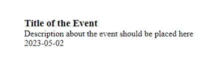
<h3 class="timeline-title">Title of the Event</h3>
<p class="timeline-description">
Description about the event should be placed here
</p>
</div>
<div class="timeline-date">2023-05-02</div>
</div>
<!-- You can add more timeline items as much as you need -->
</div>
</div>
Here, we have a container <div> with the class “timeline” that wraps the timeline items.
Each timeline item is represented by a <div> element with the class “timeline-item”.
Inside each item, there are two main sections;
- The timeline content (title and description) represented by a <div> element with the class “timeline-content”, and
- The timeline date represented by a <div> element with the class “timeline-date”.
Step 2 : Add Css to make the timeline responsive
Css

    .timeline {
      position: relative;
      margin: 20px auto;
      width: 90%;
    }
    .timeline-item {
      position: relative;
      padding: 20px 0;
      border-bottom: 1px solid #ccc;
    }
    .timeline-content {
      position: relative;
      width: 50%;
      float: left;
    }
    .timeline-date {
      position: absolute;
      top: 0;
      right: 0;
      width: 50%;
      padding: 5px;
      font-weight: bold;
      text-align: right;
    } /* Clear floats after timeline content */
    .timeline-item:after {
      content: '';
      display: table;
      clear: both;
    } /* Responsive styles */
    @media (max-width: 768px) {
      .timeline-content,
      .timeline-date {
        width: 100%;
        float: none;
        text-align: center;
      }
    }
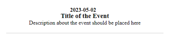
We use media query to create the responsive section of the timeline. In this example, screens with a maximum width of 768px will display the timeline content and date as full-width blocks centered horizontally. If you are not using a timeline, you may use a modal box which pop up contents when clicked.
You can follow this link to learn how to create a simple modal in Html.
This is one out of many methods to create a responsive timeline in Html. Customize the CSS styles and add additional selectors to match your desired design and functionality.