To create a responsive table using HTML and CSS, you can follow these steps:
1. Set up the HTML structure
Create the HTML structure for the table using the elements available for use in Html, these elements include;
<table> The table tag indicate that we are creating a table,
<thead> used to create the table head,
<tbody>, which is use to create the data that will appear in the table body
<tr> used to specify a table row, and
<th> or <td> elements which are used to display the table data.
Html
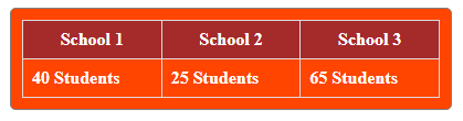
<div class="table-container container">
<table>
<thead>
<tr>
<th>School 1</th>
<th>School 2</th>
<th>School 3</th>
</tr>
</thead>
<tbody>
<tr>
<td>40 Students</td>
<td>25 Students</td>
<td>65 Students</td>
</tr>
<!-- Add more table rows as needed -->
</tbody>
</table>
</div>
2. Add CSS styles
Apply CSS styles to make the table responsive.
Css

.container {
      width: 80%;
      border: 1px solid grey;
      border-radius: 5px;
      margin: 20% auto;
      padding: 10px;
      background-color: orangered;
    }

    .table-container {
      overflow-x: auto;
    }
    table {
      width: 100%;
      border-collapse: collapse;
      white-space: nowrap;
    }
    th,
    td {
      padding: 8px;
      border: 1px solid #ddd;
      color: white;
      font-weight: 700;
    }
    th {
      background-color: brown;
      font-weight: bold;
    }
    @media screen and (min-width: 768px) {
      .container {
        margin: 10% auto;
        width: 40%;
      }
    }
Output
In this example, the .table-container selector is given overflow-x: auto to allow horizontal scrolling when the table content exceeds the container width. And you can clearly see that there is another class of container which has a predefined width across different screen sizes.
The table selector sets the table width to 100% and border-collapse to collapse to remove spacing between table cells. The white-space: nowrap property prevents table cells from wrapping to the next line.
The th and td were used as selectors to specify the padding and border properties for table headers and table data cells. The th elements have a background color and bold font-weight to distinguish them as table headers.
3. Create your own styles
You can modify the CSS styles to fit your desired design. You can add additional properties for text alignment, font size, background color, and other table-related styles.
You can also learn about other Html tags and their meaning
By following these steps, you can create a responsive table using HTML and CSS. The table will adapt to different screen sizes and allow horizontal scrolling when the content overflows the container, ensuring a better user experience when viewing the table on smaller devices.
Pingback: How to add a background image to an element using CSS - codeharis