The navbar is where links to navigate to other parts of the website are mostly placed. Creating the navbar is simple but creating a responsive navbar is not as simple as that. So in this tutorial, our focus would be on how to create a responsive navbar using Html and CSS. The steps to follow in order to create a responsive navbar using HTML and CSS are listed below:
1. Set up the basic HTML structure
Create the HTML structure for the navbar using a <nav> element and nested <ul> and <li> elements.
Html

<nav class="navbar">
      <ul class="nav-list">
        <li class="nav-item"><a href="#">Home</a></li>
        <li class="nav-item"><a href="#">About</a></li>
        <li class="nav-item"><a href="#">Services</a></li>
        <li class="nav-item"><a href="#">Contact</a></li>
      </ul>
    </nav>
In this example, the navbar is wrapped within a <nav> element with the class “navbar”. The navigation items are placed in the navigation menu using un ordered list <li> elements with the class “nav-item”. The actual links which will navigate to the specified link are represented by anchor element <a> popularly known as a tag.
2 The next thing we would do is to add CSS styles to the navbar.
CSS


 .navbar {
      background-color: #f1f1f1;
      padding: 10px;
    }
    .nav-list {
      list-style-type: none;
      margin: 0;
      padding: 0;
      display: flex;
      justify-content: space-between;
    }
    .nav-item {
      margin-right: 10px;
    }
    .nav-item a {
      text-decoration: none;
      color: #333;
      padding: 5px;
    }
    @media (max-width: 600px) {
      .nav-list {
        flex-direction: column;
        align-items: center;
      }
      .nav-item {
        margin-right: 0;
        margin-bottom: 10px;
      }
    }
Code Explanation
In this CSS code, the .navbar class sets the background color and padding for the navbar.
The .nav-list class styles the unordered list containing the navigation items. It removes the default list styles, sets the margin and padding to 0, and uses flexbox to create a horizontal layout with justify-content: space-between;.
The .nav-item class styles each navigation item. It sets the margin-right to create spacing between items.
The .nav-item a class styles the links within the navigation items. It removes the default underline style, sets the link color, and adds padding.
The @media (max-width: 600px) media query applies CSS styles when the viewport width is 600 pixels or less. In this case, it changes the flex-direction of the .nav-list to column, aligns items to the center, and removes the margin-right of .nav-item.
Result on small screen

Result on big screen

Notice the result we have on both small and bif screen are different but this is more of a beginners result. We can make our code better so that we can achieve our desired result. So we would reformat the code a little bit.
Creating a Responsive Navbar with JavaScript toggle functionality
New Html

 <nav class="navbar">
      <div class="logo-container">
        <h4>LOGO</h4>
        <button class="btn">X</button>
      </div>
      <ul class="nav-list">
        <li class="nav-item"><a href="#">Home</a></li>
        <li class="nav-item"><a href="#">About</a></li>
        <li class="nav-item"><a href="#">Services</a></li>
        <li class="nav-item"><a href="#">Contact</a></li>
      </ul>
    </nav>
    <section>
      <h5>lorem300</h5>
    </section>
In a real word design, your navbar would have a logo, so we need to add the logo and We also need to add a button which will act as a toggle button in such a way that, whenever we click on the button on a small screen, the links will show and we can still click on the same button and the links will be hidden.
We also reformatted our CSS because we needed to do add more class and style to achieve our goal of creating a responsive navbar
New CSS

body {
  background-color: tomato;
}
.navbar {
  background-color: #f1f1f1;
  padding: 10px;
  display: flex;
  justify-content: space-between;
  width: 100%;
}
.nav-list {
  list-style-type: none;
  margin: 0;
  padding: 0;
  display: flex;
  justify-content: space-between;
  /* align-items: end; */
  width: 40%;
  /* border: 2px solid red; */
}
.btn {
  display: none;
  color: white;
  background-color: black;
  font-weight: 700;
  border: 1px solid grey;
  border-radius: 5px;
  padding: 0.3rem;
  outline: none;
  cursor: pointer;
  transition: all 0.3s linear;
}
.btn:hover {
  transform: rotateZ(180deg);
}
@media screen and (max-width: 600px) {
  .nav-list {
    width: 55%;
  }
}
.logo {
  width: 30%;
  border: 2px solid red;
}
.nav-item {
  margin-right: 10px;
}
.nav-item a {
  text-decoration: none;
  color: #333;
  padding: 5px;
}
@media (max-width: 500px) {
  .navbar {
    display: block;
  }
  .logo-container {
    width: 100%;
    /* border: 2px solid red; */
    display: flex;
    justify-content: space-between;
    margin-bottom: 1rem;
  }
  .btn {
    display: block;
  }
  .nav-list {
    display: none;
    flex-direction: column;
    align-items: left;
    /* justify-content: left; */
    transition: all 0.2s linear;
  }
  .nav-item {
    margin-right: 0;
    margin-bottom: 10px;
  }
  .show-hide {
    display: block;
  }
}

JavaScript
const navList = document.querySelector('.nav-list');
const btn = document.querySelector('.btn');

btn.addEventListener('click', function () {
  navList.classList.toggle('show-hide');
});

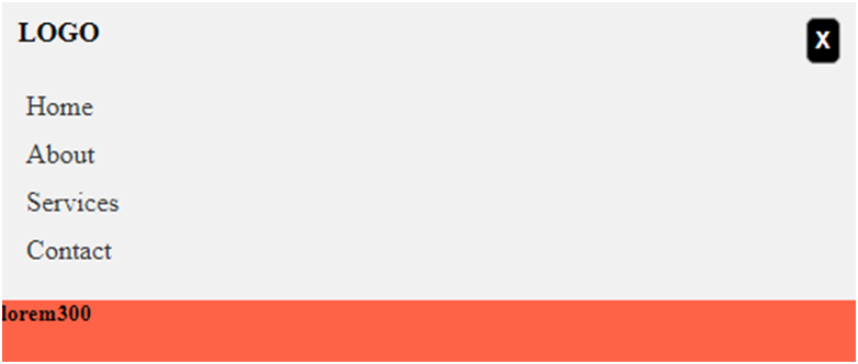
Notice the links are all showing with the logo. Also notice that the button we added is not displayed because it set to be hidden on a large screen.
Navbar and footer are two major components of a webpage used for easy navigation. You can also learn how to create a responsive footer using Html and Css by following the link.
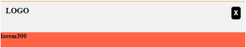
Notices there are no links shown on a small screen, just the logo and the toggle button. So when we click on the button, the links will all show up and when we click on it again, the links will be hidden as shown on the image below.
You can checkout how to create a modal or how to create a tooltip using Css
Explanation of code
So what happen is that, we used JavaScript to add the show and hide functionality to the links.
First, we target the container of the link which is the nav-list.
Secondly, we target the button and then add an event listener to it. After adding the event listener, we added the toggle functionality using the built in function “toggle” with the show-hide class which we created in our CSS.
This is just a basic way of creating a responsive navbar, you can always make it more dynamic if you want, but since our goal is to create a simple responsive navbar using Html and Css, we go with this one.
Always remember that you can modify the CSS styles as needed to match your desired navbar design. Although, we added a little bit of JavaScript, but hopefully by following these steps, you can create a basic responsive navbar using HTML and CSS.
Pingback: Hover Effect Using Css - codeharis
Pingback: CSS clear property - codeharis
Pingback: Display Date In Letters Using JavaScript - codeharis
Pingback: How To Create A Responsive Footer Using Html And Css - codeharis